When it comes to small business websites, especially for service-based businesses, design isn’t just about looking good — it’s about guiding visitors toward taking action.
Whether you're a plumber, coach, photographer, consultant, contractor, or cleaner, the
right website layout can mean the difference between someone bouncing off your page or becoming your next paying client.
So what does an effective layout look like?
In this post, we’ll walk through the
best website layout tips, show you proven
service business website examples, and help you understand what works — and why.
Why layout matters for service-based businesses
For product-based companies, the website's job is to sell. But for service-based businesses? The goal is usually to:
- Build trust
- Explain what you do
- Make it easy to contact or book you
Your website layout needs to
remove confusion, build confidence, and guide visitors toward one clear action — usually scheduling, calling, or submitting a form.
The right structure does exactly that.
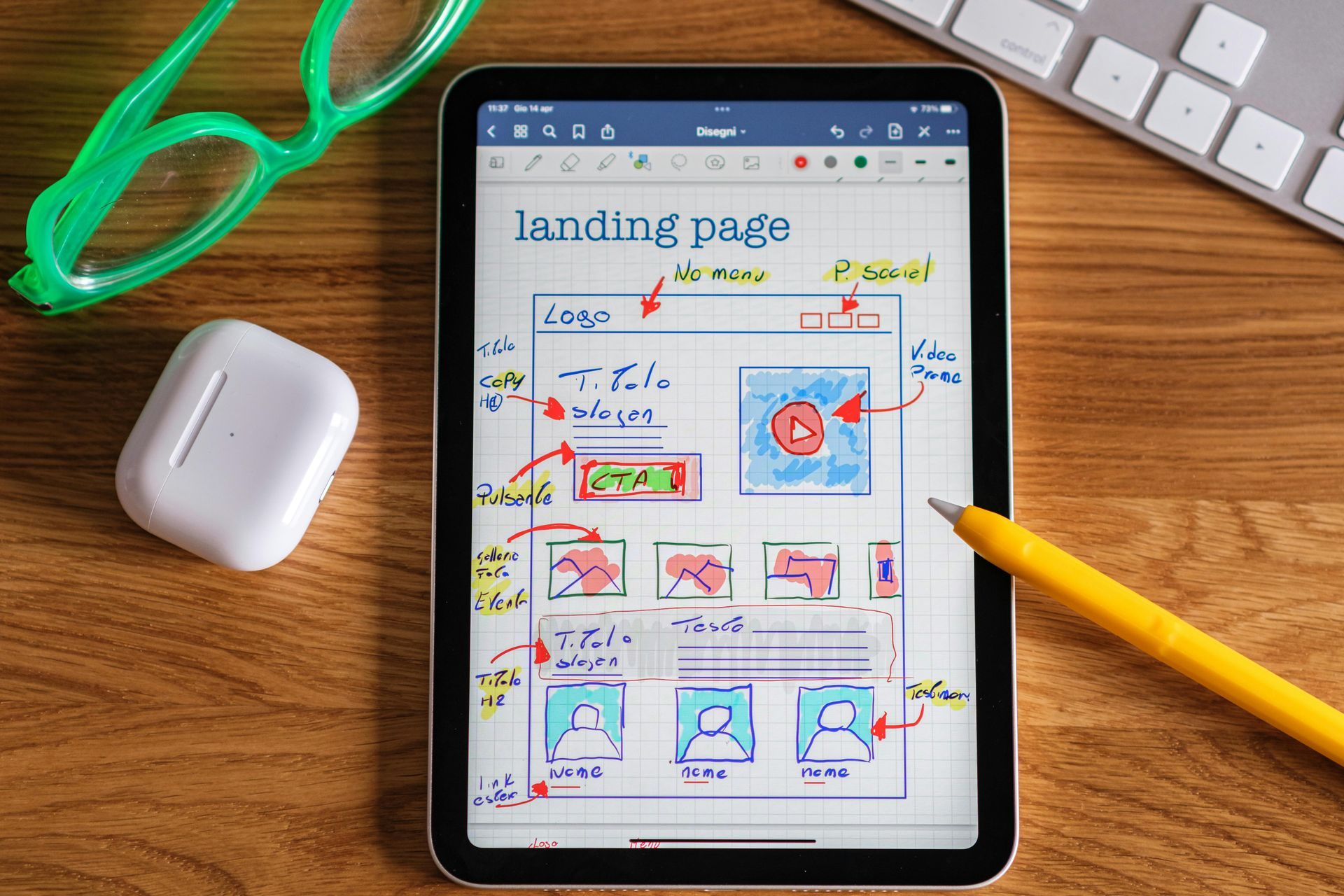
Best website layout for small business (service-based)
Here’s a high-performing layout formula we use at Wibsy for service-based businesses:
1. Hero section (top of homepage)
Purpose: Grab attention, clearly state what you do, and guide the user forward.
What to include:
- A clear headline: What do you offer and for whom?
Example: “Reliable Lawn Care for Busy Homeowners in Naperville” - Subheading: Expand on your unique value or differentiator
- Call-to-action (CTA): “Request a Quote,” “Book a Free Call,” “View Services”
- Optional background photo or short video that reflects your work
✅ Pro Tip: Keep it above the fold (visible before scrolling).
2. Services snapshot
Purpose: Help users quickly understand what you offer.
What to include:
- 3 to 6 service “cards” or icons
- Short descriptions
- Links to deeper service pages (if applicable)
✅ Pro Tip: Use action-focused titles like “Interior Painting,” “Website Design,” or “Weekly Lawn Maintenance.”
3. Why choose you (value section)
Purpose: Differentiate your business and build trust.
What to include:
- 3–5 key benefits (e.g., fast turnaround, licensed and insured, 5-star service)
- Icons or simple graphics
- Optional testimonial quote or badge
✅ Pro Tip: Think from the customer’s perspective. What makes you the safe choice?
4. Social proof / reviews
Purpose: Show potential customers that others trust you.
What to include:
- Google reviews, Facebook reviews, or testimonials
- Star ratings, if available
- Client logos (if B2B)
✅ Pro Tip: Include real names, cities, and photos when possible. Authenticity matters.
5. Featured work or case studies (optional)
Purpose: Let your work speak for itself.
What to include:
- Before/after photos
- Short client stories or project overviews
- Results or outcomes
✅ Pro Tip: Even one strong example can boost conversions.
6. Call-to-action (again!)
Purpose: Remind them what to do next.
What to include:
- A clean, simple section with a CTA
- Example: “Ready to get started? Book your free consultation today.”
✅ Pro Tip: Place this at the bottom of the page to catch visitors who scroll all the way down.
7. Contact info or form
Purpose: Make it ridiculously easy to reach you.
What to include:
- Simple contact form (Name, Email, Message or Phone)
- Your phone number, address (if applicable), and email
- Business hours
✅ Pro Tip: Don’t make people dig for your phone number. Repeat it in multiple places.
Real-world service business website examples
Here are a few hypothetical examples of this layout in action:
- Landscaping company:
Hero photo of a freshly manicured lawn → list of services → “Why Choose Us” with photos of happy customers → CTA to book estimate - Web design studio:
Clear headline about helping small businesses stand out → 3 service tiers → case studies → reviews → CTA to book a discovery call - Cleaning service:
Simple, bold headline → list of cleaning packages → icons for “licensed, bonded, insured” → customer testimonials → contact form
These layouts work because they make information easy to find, visually guide users, and focus on one main goal:
converting visitors into leads.
Final website layout tips for service businesses
- Keep it simple. Too many pages or fancy effects distract more than they help.
- Lead with benefits. Don’t just say what you do — explain why it helps.
- Guide the user. Every section should flow naturally into the next.
- Repeat the CTA. Don’t be afraid to ask for the click more than once.
- Be mobile-first. Your site should look amazing on phones — that’s where most users are.
Need help putting it all together?
At Wibsy, we specialize in building
custom websites for service-based businesses — using layouts that are proven to work. Whether you’re launching something new or need to refresh your existing site, our monthly subscription plans include everything: strategy, design, build, and support.
You don’t need to worry about what goes where. We handle that for you — and we design every site with
results in mind.
Let’s build a website layout that actually works for your business.
Explore our affordable plans.